Container Queries Are Here!
With the release of Firefox 110, CSS container queries are now supported in all major browsers! It has joined Chromium (since v105) and Safari (since v16) in adding support to what I consider a revolution on responsive web development, especially to people who build UIs in a component-driven way.
What are container queries?
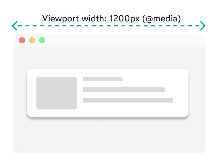
Usually when we do responsive development, we use media queries to change the layout of our components based on the viewport/screen/window size. So, for example, we can have a card component that's displayed like this on a laptop:

And, if the window size is smaller (for example on mobile), we can use a media query to change how the card is displayed:

This can be done with code like this:
			<style>
    .card {
        display: flex;
        flex-direction: row;
    }

    @media (max-width: 600px) {
        .card {
            flex-direction: column;
        }
    }
</style>

<div class="card">
    <!-- card content -->
</div>
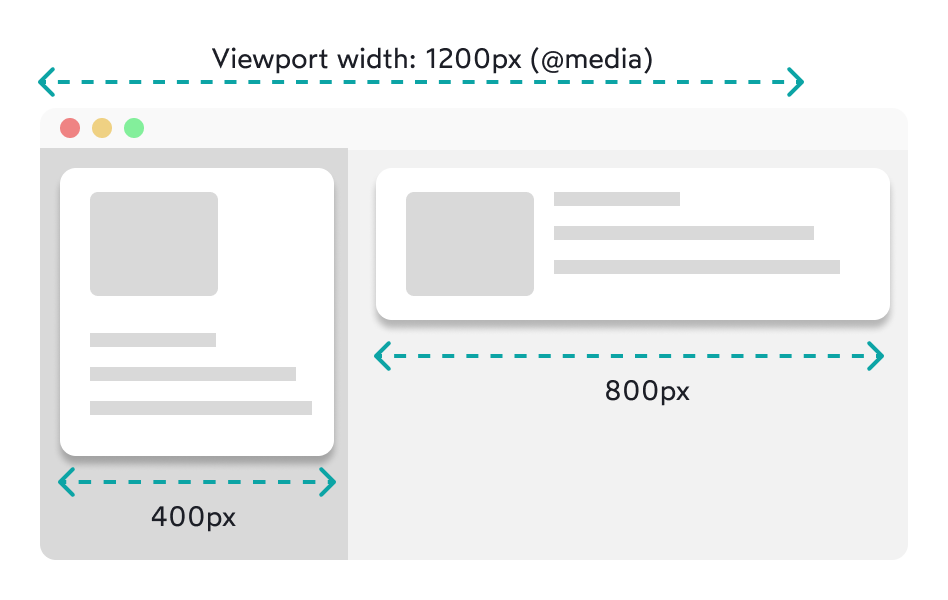
So far, so good. But what if the card doesn't take up the entire width of the screen? We might want to display it in a sidebar with much less horizontal space, and have another card in the main content area, taking up the rest of the screen width. Here's how we want it to look:

But how can we do this, if the screen is not small enough to trigger our media query and display the card's contents vertically? Previously, the ways of doing this were either to use JavaScript (by checking the window width every time it changes and then toggling a class in the card component) or using flex-wrap: wrap, which is better than using JavaScript, but really hard to get right.
This is where container queries come in. With container queries, we can change the layout of our components based on the size of the container they're in. So, instead of using the viewport size to control how the card is displayed, we can use the size of the card's container.
How to use container queries
Starting from the problem described above, we can use container queries to fix it like this:
			<style>
    .container {
        /* A containment context needs to be declared on the container element */
        container-type: inline-size;
    }

    .card {
        display: flex;
        flex-direction: row;
    }

    /*
    Instead of @media, we use @container to use its size instead
  */
    @container (max-width: 600px) {
        .card {
            flex-direction: column;
        }
    }
</style>

<div class="container">
    <div class="card">
        <!-- card content -->
    </div>
</div>
<div class="container">
    <div class="card">
        <!-- card content -->
    </div>
</div>
Now, if the card's container is smaller than 600px, the card will display its contents vertically. If it's larger, it will display its contents horizontally.
Nested Containers
In situations where we would have nested containers, things can get a bit messy. That's why you can also name a container, using the container-name property, and then use that name in the @container rule. In this example, we want the card to use the .outer-container's size as a base, instead of its immediate parent container's size:
			<style>
    .outer-container {
        container-type: inline-size;
        container-name: outer-container;
    }

    .inner-container {
        container-type: inline-size;
        container-name: inner-container;
    }

    .card {
        display: flex;
        flex-direction: row;
    }

    @container outer-container (max-width: 600px) {
        .card {
            flex-direction: column;
        }
    }
</style>

<div class="outer-container">
    <div class="inner-container">
        <div class="card">
            <!-- card content -->
        </div>
    </div>
    <div class="inner-container">
        <div class="card">
            <!-- card content -->
        </div>
    </div>
</div>
Easy, right?
Fallback for older browsers
As mentioned before, the latest versions of all major browsers support this feature. However, some users might take a while to update their browsers and your site might look broken in the meantime. To avoid this, you can add a feature check in your CSS that checks for container queries support and only apply the styles if the browser supports it:
			@supports (container-type: inline-size) {
    /* container queries styles */
}

@supports not (container-type: inline-size) {
    /* fallback styles */
}
As for fallback styles, I recommend giving flex-wrap: wrap a try. It's not that easy to use, but you can emulate the behavior of container queries in a way that's good enough for the users who haven't updated their browsers yet.
Wrapping Up
Years ago, when I started learning about responsive development and working with components, I eventually hit a barrier when I couldn't find a good way of making components adapt to their size like this. Which is why I'm so excited this is finally happening! It's an exciting time to be a web developer and I can't wait to see what's next.
