Smarter, Lighter, Better Images: A Guide to Optimization
Do you know how big the images displayed on your website are? When you open a page, the browser starts downloading a bunch of files in order to display it. Research shows that images are the most requested asset type and take up more bandwidth than any other resource. So, making sure they are as small as they can be can greatly improve the load times for your website. (spoiler alert: mine's become 85% faster!)
More efficient formats
For a long time, JPGs and PNGs have been our standard image formats. However, they are not optimized for the web - their quality is often unnecessarily high and the download size is too big. Over time, many new formats have appeared, but two of them have become quite notable: WebP and AVIF.
WebP has been introduced in 2010, and has slowly gained adoption since then. Since 2020, WebP is now supported in all modern browsers. AVIF was launched in 2020, and its adoption has been faster. As of May 2023 it is supported by all major browsers except Edge. You can always check out the up-to-date support status on caniuse.com.
Browser Support
But how do we use those shiny new formats if not all browsers support them?
With the <img> element, we can make the browsers do the work for us. We can declare multiple sources for the same image, and the browser will try to load them in order. If they do not support a format, they will immediatelly jump to the next one. To do that, we use the srcset property to declare the optimal versions (avif and webp), and then use the src as usual to point to the fallback image (jpg or png).
So, what we want to do is declare those different sources in the following order:
AVIF -> WebP -> JPG (or PNG)
			<img
  srcset="my-image.avif, my-image.webp"
  src="my-image.jpg"
  loading="lazy"
  decoding="async"
/>
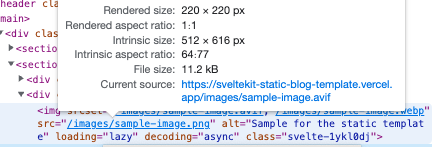
If you look at the resulting HTML in your website, you can see that the <img> element has a src defined, but when you hover over it, it shows what is the actual file that's being loaded. If you're on a supported browser, it will have loaded the AVIF file. If you're on Safari, it will have loaded the WebP one. Otherwise, if you're using IE or something (I'm sorry), the original JPG or PNG file will be loaded.
Load smaller images
You can optimize even further than that. See, in my example, I am loading an image with a width of 1200px, however, the size it's being displayed is only 319px wide. The srcset property supports different widths to load, depending on the screen size.
			<img
    srcset="my-image-380w.avif 380w, my-image-640w.avif 640w, my-image-960w.avif 960w"
    sizes="(max-width: 979px) 100vw, 640px"
    src="my-image.jpg"
    loading="lazy"
    decoding="async"
/>
The srcset property is smart. As the name implies, it is a set of sources, not just a single one. When we declare multiple file paths and add a width unit besides it, the browser looks at this data and tries to display the smallest possible image.
On the code snippet above, the browser will follow this: If the size of the displayed image (on the page) is smaller or equal to 380px, it will load the file with 380px of width. Otherwise, it will try to load the next declared path (640px).
However, not all parts of this process are smarty. The browser cannot know what is the final size of the image on the page before it actually loads it. Which is why the sizes property exists. Let's see how it works:
The sizes property defines what rule the browser will use to get the width it uses to choose the correct file in srcset. The default value is 100vw. That means that, to check what width the image will have, the browser just gets the width of the browser window. If we know the exact size the image will have on load, we can declare it here, or if we don't know the exact size, we can estimate. We can use media queries to help us specify the sizes better as well.
Check out the value on the example: (max-width: 979px) 100vw, 640px. What that code does is: if the width of the viewport is equal or smaller than 979px, use 100vw. Else, use 640px.
It is easier to understand if we visualize it like this:
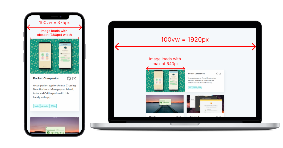
Of course, different websites have different needs and situations. Make sure to adapt the code to your specific need.
It's also worth noting that most phones use a HiDPI mode. This means that even though the reported width for the phone above is 375px, the browser will likely use a higher resolution to load the images (usually 2x), in order to serve a higher quality image.
Lazy Loading and Async Decoding
You might have noticed the loading="lazy" and decoding="async" attributes in the code above. Those are relatively new options that are part of an ongoing effort to make the web faster.
decoding="async" tells your browser it can try to parallelize loading your image. When your page is loading, it tries to decode both text and images at the same time. On lower-end devices though, decoding heavy images can take a while, and this might block the rendering of the rest of the content. With this option, the browser will try to proceed rendering the rest of the content and render the image later. This can be a great improvement to perceived performance.
loading="lazy" is probably the most important of the two. It is an easy way of telling the browser to only load the images when they get close to appearing in the viewport . There is a threshold that is defined by the browser that controls how close it needs to be before it gets loaded, so you don't have to worry about them not showing up if the user scrolls fast. This ensures that the initial load of the website is as lean as it can get, improving perceived performance and also saving you some money on server requests.
Results In Practice
Since I like using my own website and blog as a testbed for new stuff that I learn, I have applied these optimizations to it. The results were incredible!
Note: after doing some tests, I have decided that the benefits of serving differently-sized images on my website were too small to justify the extra effort of handling all these extra images. So, the only optimizations I have really applied were the optimized file formats, lazy loading and async decoding. I also chose PNG as fallback type instead of JPG because some of my images have transparency in them, which JPG does not support.
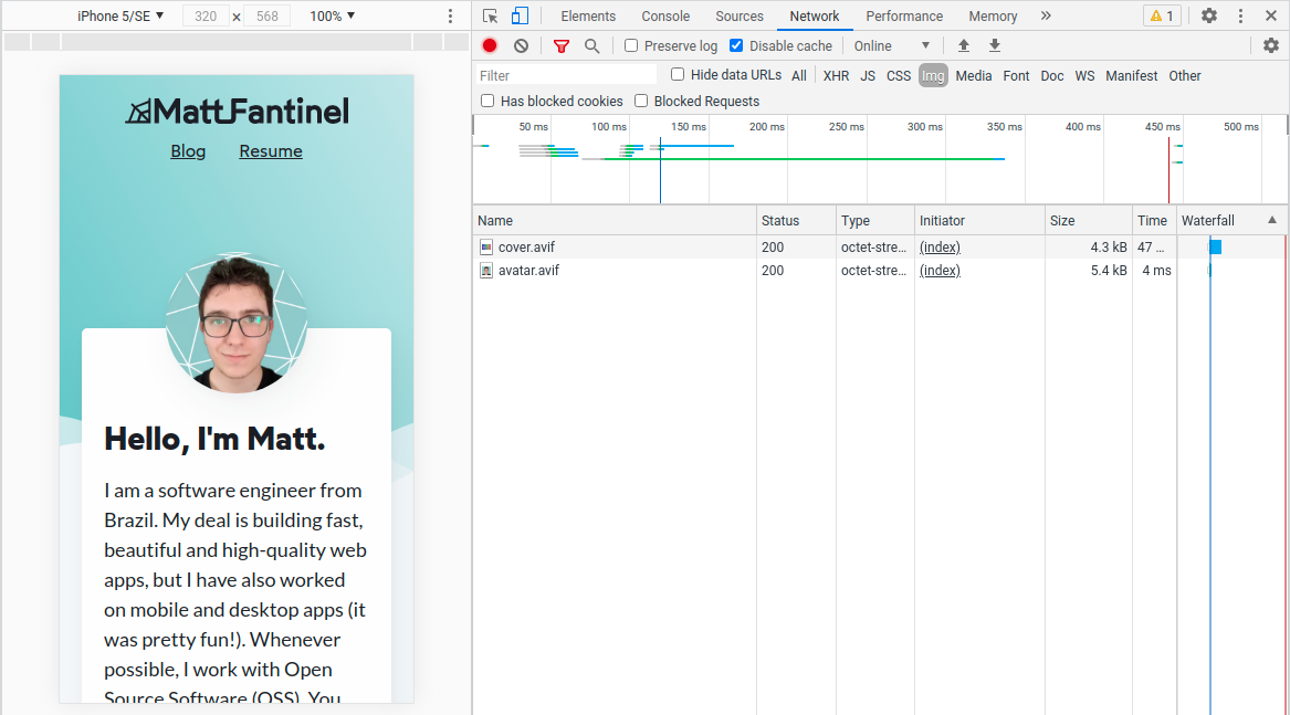
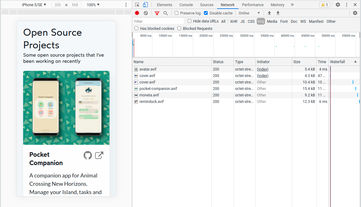
The following data is taken from the home page of the website, since it has a lot of images:
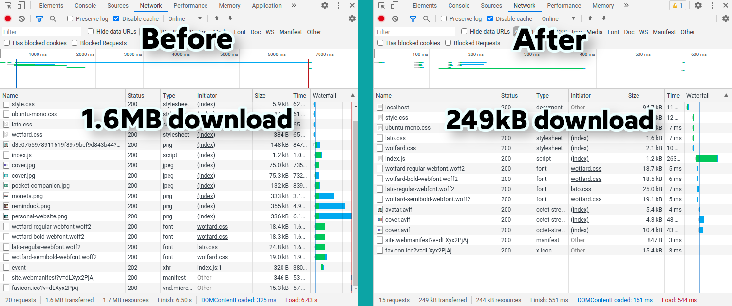
The total download size decreased by a whopping 85%!! That's an incredible difference, with no noticeable difference in quality. Your results may vary, as they depend on how much of your website's size is images.
Before the changes, out of 1.6MB total, 92% of it were images, 5% were fonts, 1% was HTML, and the remaining 2% were of JS and other things like the web manifest.
Now, out of 249kB, just 24% of it are images. Fonts now make up 27% of page size, and are likely the target of a future optimization post!
The Hard Part
The hardest part of this process is converting the images to all necessary formats and sizes. It is a lot of effort to do manually even for a single image, and even worse if you're trying to optimize existing images like I was.
Generating the Images
For my needs, I have developed a NodeJS script that uses the Sharp library to do the magic for me. It accepts as parameters a source and a target folder, input file types (what files it will look for in the source folder), output file types (what types it will convert to), as well as the desired widths.
You can install the script as a NPM package, and then run it on a build command on your website!
Check out image-transmutation! See usage exampleUsing the images
To make this setup work, I had to do some changes on how images were used on my website.
Pre-existing conditions:
- All the images on my website were initially in a folder called "images", with various subfolders;
- I didn't want all the versions of an image (webp, avif, etc) to take up space on my repository, so I only have them generated on build time.
Modifications I did:
- I have created a component to centralize all image-loading logic;
- This component receives two parameters: the file path and the alt text;
- If my project is running in dev mode, it won't add the srcset at all, as the optimized images won't exist;
			<script lang="ts">
    // This is a SvelteKit environment variable. If it's true, it means the project is running in dev mode.
    import { dev } from '$app/environment';

    // Declare the accepted parameters
    export let src: string;
    export let alt: string;

    // Declare the formats used for images
    export let formats: string[] = ['avif', 'webp', 'png'];

    // Get just the file name without extension (so "image.png" becomes "image")
    $: fileName = src.split('.')[0];

    // Function to build the srcset string
    function buildSrcset() {
        // If project is in dev mode, I don't want a srcset since images aren't optimized yet
        if (dev) return;

        let srcset = '';

        // Cycle through formats and add them to the srcset
        for (let i = 0; i < formats.length; i++) {
            srcset += `${fileName}.${formats[i]}`;

            if (i < formats.length - 1) {
                srcset += ', ';
            }
        }

        return srcset;
    }
</script>

<!-- Now we just use the default img element! -->
<img srcset="{buildSrcset()}" {src} {alt} loading="lazy" decoding="async" />
And to use this component inside another page:
<image src="my-image.png" alt="Example image" />
The full component code and usage example can be seen at my SvelteKit blog template repository. That might be more up to date than here, even!
Wrapping Up
With such amazing results, it's hard not to recommend you to optimize the images in your website ASAP. There sure are more approaches and optimizations that can be done besides the ones presented on this article, as the web world is always changing. But optimizations are a great way of showing respect to your users (as well as gathering more of them). Your site loads more quickly, and it uses less data and resources.
As front-end developers, we must acknowledge that all we write runs on someone else's computer, the user's. So it is important that we respect them and make sure we just use the resources we need to.
I hope you enjoyed reading this! Take care and happy coding!
